Candlestick charts were originated in Japan over 100 years before the West had developed the bar charts and point-and-figure charts. In the 1700s, a Japanese man known as Homma discovered that as there was a link between price and the supply and demand of rice, the markets also were strongly influenced by the emotions of traders.
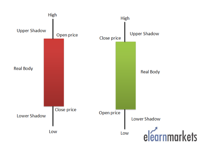
A daily candlestick charts shows the security’s open, high, low, and close price for the day. The candlestick’s wide or rectangle part is called the “real body” which shows the link between opening and closing prices.
This real body shows the price range between the open and close of that day’s trading.
When the real body is filled, black or red then it means that the close is lower than the open and is known as the bearish candle. It shows that the prices opened, the bears pushed the prices down and closed lower than the opening price.
If the real body is empty, white or green then it means that the close was higher than the open known as the bullish candle. It shows that the prices opened, the bulls pushed the prices up and closed higher than the opening price.
The thin vertical lines above and below the real body is knowns as the wicks or shadows which represents the high and low prices of the trading session.
The upper shadow shows the high price and lower shadow shows the low prices reached during the trading session.

im no expert on candlesticks but they are my bar of choice. They help me as warnings for my position and alerts of potential opportunities. be mindful of where they appear in a trend or formation- as in reversal candle or reversal candle pattern needs to appear in an area where a reversal is "due" or "likely", not just 1/2 way there ,lets say.
This comment is rather vague I know, maybe someone could make it "make" more sense. Kinda late.
John
Makes great sense to me John.
maybe we can all learn a few things by going over some of the patterns.
my first several years trading, in the early and mid 90s, before the internet, I spent at least an hour every single day after the markets closed to update the charts for almost all the major commodities that included drawing trend lines.
even in markets that I never traded or planned on trading.
just like with the best meteorologists using weather pattern recognition to spot,pattern changes early to be one step ahead of others with dialing it into weather updates in the early stages of the daily forecast And also putting on a position early….before the market reacts.
price charts have pattern recognition signatures too that often have predictive power, that can be be especially powerful when combined with other tools.
gaps in certain, places, trend lines, support/resistance and so on are useful signs that tell us things about traders buying/selling tendencies. That help us pr3dict what will come next.
after the internet did all the plotting, it seemed less important to spend so much time doing all that work.
however, if you want to be tuned best into a market…hand plot the daily Price.
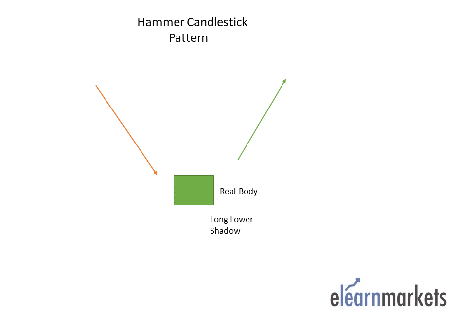
Hammer is a single candlestick pattern that is formed at the end of a downtrend and signals bullish reversal.
The real body of this candle is small and is located at the top with a lower shadow which should be more than twice the real body. This candlestick chart pattern has no or little upper shadow.
The psychology behind this candle formation is that the prices opened and sellers pushed down the prices.
Suddenly the buyers came into the market and pushed the prices up and closed the trading session more than the opening price.

This resulted in the formation of bullish pattern and signifies that buyers are back in the market and downtrend may end.
Traders can enter a long position if next day a bullish candle is formed and can place a stop-loss at the low of Hammer.
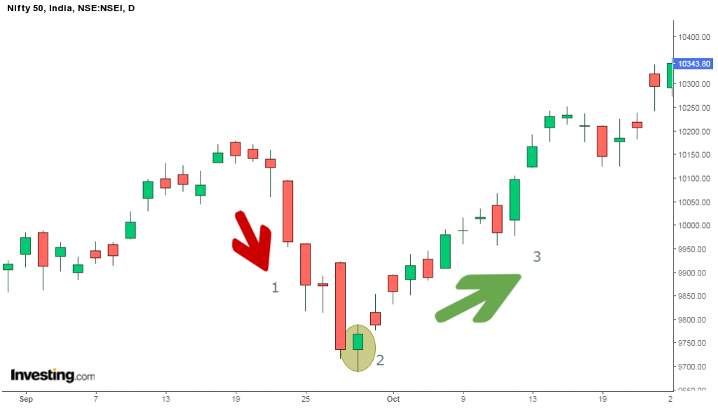
Below is an example of Hammer candlestick pattern:

This an illustration of my comments above.
When the hammer works, it will always appear to be at the bottom of a trend. The tricky part is determining if it's appearance has happened at the trend culmination before subsequent candles confirm or not confirm.
You need to have a handle on what is a likely length of the trend U R dealing with.
Then place your bets and practice the ole risk management game.
John
When used properly the hammer is as reliable as any of them. ??!
Great points John,
I feel like these patterns worked much better in the 1990s and maybe until around 15 years ago.
Since then, it seems like market manipulation, sometimes designed to take out people trading these patterns with tight stops are in control at times.
Similar to this pattern with regards to how it looks are the inverted hammer, hanging man and shooting star. I’ll post those next.
I generally play something like a $200- stop loss and a profit target around $600-.
3 to 1 but with this manipulation and algo trading (just blaming anything here) I fear pushing much pass a 1/1 or 2/1.
Those limitations dont bode well for the profits. I trade mostly AUD CAD EUR.
John
A currency man, I see.
Mostly grains and NG for me.
And anything that weather affects that be.
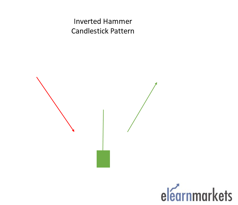
An Inverted Hammer is formed at the end of the downtrend and gives a bullish reversal signal.
In this candlestick, the real body is located at the end and there is a long upper shadow. It is the inverse of the Hammer Candlestick pattern.
This pattern is formed when the opening and closing prices are near to each other and the upper shadow should be more than twice the real body.

metmike: Same as hammer except the open and close are at the bottom of the range and the open......is the low.
With the hammer, it closes on the high, which is much more bullish to me. I'm not as bullish with this one because it closes too far off the high.
Especially in this age of day trading, I think the close is most important. It shows what traders are most confident about holding on to based on more than day trading gyrations.