I thought I'd try the new forum with a test post that included charts.
The first is a chart of the S&P500 on a normal linear scale.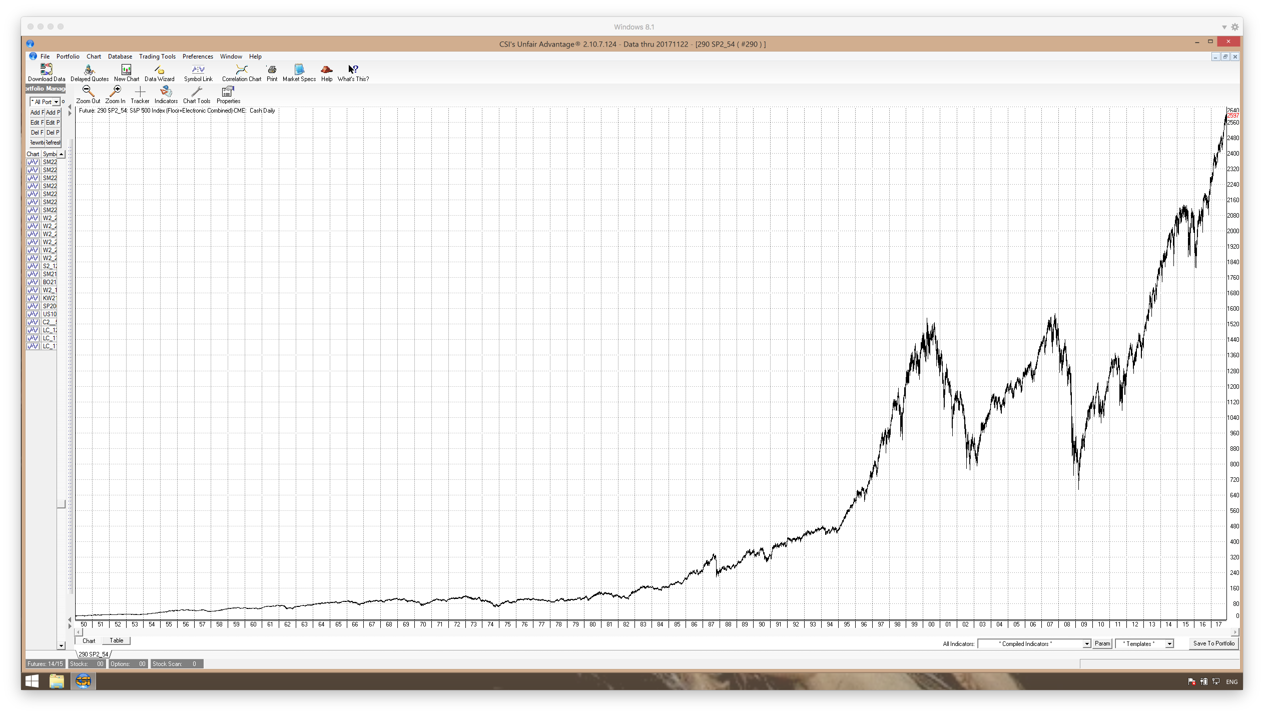
Now, it has an exponential look, so I looked at it charted on a semilog scale.
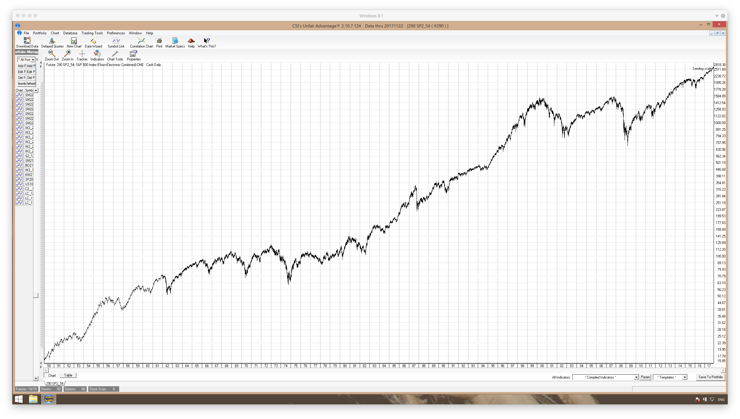
The first chart looks like a runaway market. It looks like it has to crash - and soon - at least to many analysts who are commenting. The second chart, which IMHO is the better way to represent the data, looks to be pretty straight line, as expected. While we know that these usually end badly, so far it is behaving pretty normally. It is interesting to look at the 1987 crash, which seemed gut-wrenching at the time - enough so that Alan Greenspan felt the need to "save" us.
I'll post this an see if it comes through ok before posting any more charts.
Well, that didn't come out like I thought it would. I expected that, since this format is fixed, a person might be able to click on an image and it would open full-screen.
Maybe I'm doing something wrong. I'll wait to post the rest until someone gets back to me about this. The images as they are presented are not very useful.
OK, this is an edit to point out that a person can right-click on the image and choose to open it in a different window.
Here I have split the chart (on semilog scale) into two parts - 1950-1983 and 1984-2017.
.png)
.png)
Now, if person can't see the business cycle here, I don't think they are looking. (g) I can only assume that this cycle has been driven by the Fed not wanting to piss off the incumbent politicians in election years.
Now, look at 1986, when this cycle "should have" bottomed. Seems like it was too bullish to put in a normal healthy cycle low. It hesitated, and roared up into the 1987 high - and crashed. The cycle, however, did return to its normal phasing following that crash.
Since the 2009 corrective low, my guess is that we have not seen the driver to this cycle - the Fed tightening up in between elections. *If* we have seen a phase change, the 2011 high/low was a half-cycle from the 2009 low. Also, the highs and lows since appear to still show signs of the four year cycle.
What is coming? I think we can assume that Yellen will not upend the applecart before leaving. I think we also can assume that Trump will not appoint someone who will do it either. Trump is not going to appoint another Paul Volcker - at least knowingly.
One more thought - we see a low in 1974 - right with the thirty year cycle high in corn. Again in 2009? I was making trips back and forth to Alaska in the 70s, and I remember the Canadian Dollar being strong like it has been just recently too.
One more post on this. What does a move like this look like compared to a move into the 1987 high?
This is a linear chart of the time period 1950-1987. At the time, everyone was very much afraid of this move. Again, Greenspan "saved" us - probably the worst thing he could possibly have done.
.png)
Now, look at the current time - going back the same number of years as the previous chart. This is from 1978-2017.
.png)
Doesn't look all that much different, does it?
Note - this does not mean that it is certain that we will have a similar correction. It does suggest, however, that *if* we did, we still could be in a roaring bull market - even if we see a 35% correction. That would take the DOW down - what? - 8000 points??
We all know that the likelihood of exponential moves ending badly is very high. But, as always, we don't have any idea about when.
We used to have such a nice well-behaved cycle - until the bankers totally screwed it up.
thank you kindly for the charts !
One more comment. IMHO, looking at the second chart in the first post, the semilog chart from 1950 to present, there appears to be nothing at all out of the ordinary going on now. All of the "talking heads" or internet commentators are wringing their hands about how there is no precedent for current market action. This chart, again IMHO, does not imply that at all.
Edited to add - this, of course, does in no way say that there will be no correction - or even major top. This market desperately needs a serious correction to be "healthy" - but what we are seeing is merely a continuation of what we have seen for a long time.
Thanks and please keep posting as I find this food for thought.
Do you think that the 4 year cycle has re phased?
Just guesses, of course.
First, the four year cycle reverted right back to established phase after the slight delay in putting in a low in 1987.
But, if we assume that this cycle has had a very strong driving force, and that recently that driver has not been active, it is a big question at this time whether or not the cycle will come back into the original phase and bottom in 2018.
It is interesting that the cycle still seems to show a tendency toward a four year phase, even though the possible driver no longer seems active. *If* this new phase continues, a low should be seen in 2019. The 2015/2016 low was not all that strong, so I suspect that we are due for a good one next time. Short term, however, is there any reason why this cannot go on for some time? Increasing borrowed money drives it, and longer term, we know that eventually the "renter" society leads nowhere good. But, short term, more and more money owed to fewer and fewer people can continue, especially with near zero interest rates.
So, without a strong driver, can this cycle continue? They are terrified of taking the punchbowl away - and rightly so.
I don't know, and I suspect no one else does either. What these charts do show, IMHO, is that there is nothing really all that different now than at any other time shown in these charts - as far as how fast stocks are climbing. The rate of climb is linear - from an investment point of view. And, I think we need to view all the comments about how this is unprecedented as pure guesses. That's the thing about an exponential curve - you can take any part of it and expand it, and it looks like any other part of it - when scaled similarly.
What we do know - at least what I think I do know - is that any market that does not have its periodic corrective cycle lows WILL get unhealthy. For a perfect example, just look at these charts at he 1987 low. It was due in 86, but bullishess overrode it, and we saw the crash in 87. Of course, this is a real threat today. But, when wealthy investors/bankers come out and say that the market is overvalued, don't we have to wonder if they really want to buy a correction?
Again, just the thoughts of a poor dirt farmer. FWIW.
Ok, thanks. I'm thinking, however, that it might be best to right-click the chart and choose "Open in new tab." That way, the chart can remain open while you read the text just by switching from tab to tab. Also, this does not limit the size, as it opens pretty much full screen in the new tab.