Please take some time to look at the data/map and read the entire analysis below. You won't be disappointed! The descriptions below were written on April 1st but the maps are updated daily.
US Health Weather Map
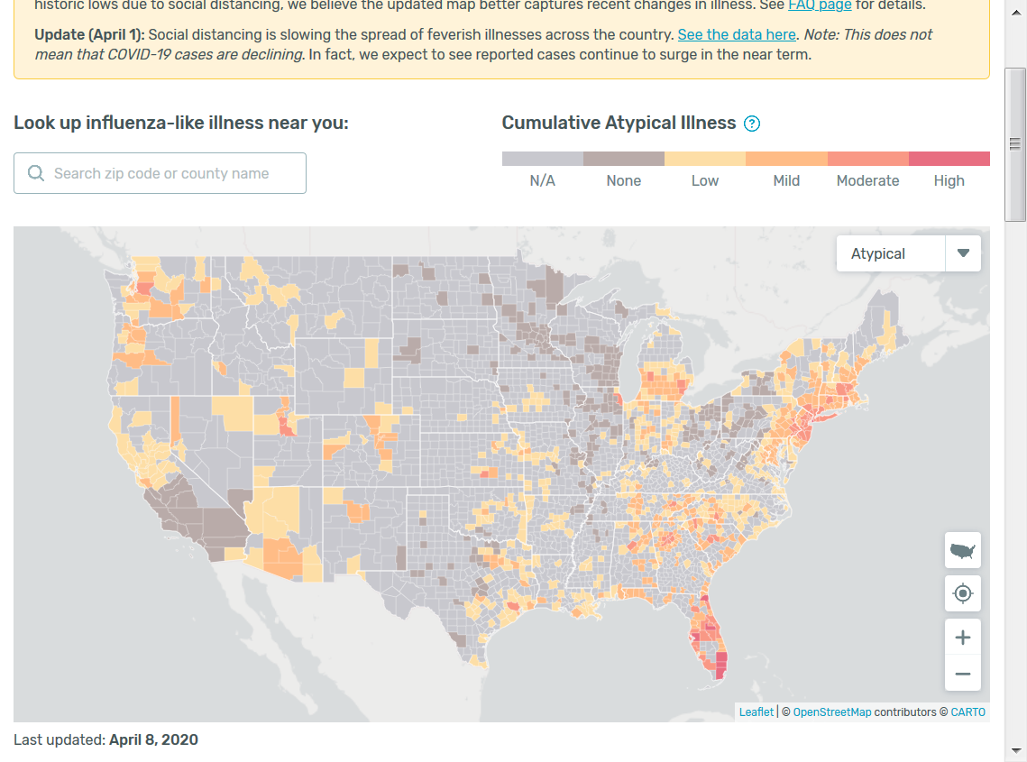
metmike:
The top map shows the current conditions COMPARED TO AVERAGE for this date. It clearly identifies the red hot spots where a lot of people are sick right now from the flu or COVID-19.
The 2nd map shows the trend for the last 7 days.
Blues on the map below show DECREASING fevers........for all illnesses.
In the previous 4 years, this tracked closely with and accurately with the flu(and other illnesses with a fever). In 2020, it shows a combination of fevers from the flu, coronvirus and other illnesses. They have all been plunging lower during the 2nd half of March...............even while new CONFIRMED BY TEST cases of coronavirus are still going up.
This is because fevers are a LEADING indicator. People have a fever for a couple of days BEFORE they get medical attention. After they sought medical attention(before tests were widely available recently), they then could be tested. The test results sometimes took/take over a week to come back. So their fevers were first reported on the maps below, in many cases well over a week before they showed up or will show up as a new coronavirus case.
https://healthweather.us/?mode=Trends
.png)
.png)
metmike: Note the graph above that shows fevers plunging lower shortly after the draconian/extreme shutdown measures took place ............dropping BELOW the expected, dashed blue line around 2 weeks ago.
This is powerful evidence that the spread of ALL illnesses(with fevers) has plunged.............before the new cases showing up as a statistic. New infection case statistics based on a test coming back positive for COVID-19 are a lagging indicator of the reality. In fact, because of early testing flaws, until recently, the lag was possibly over 2 weeks. This is why we have needed to catch up on the testing before we could get a better handle on the reality. There is still a significant but closing lag and there will always be a lag of X number of days because of the time between when a COVID-19 person first reports a fever(and pops up on this data base) and when the CDC records them as a new COVID-19 case after their test results come back.
Regardless, the % of people ill on the graph above(most with the flu because many more people have the flu), based on this metric has plunged from over 7% of those in the data base to less than 2%.
Further analysis. The dashed blue line follows the seasonality of the flu virus. The higher numbers in February were expected and mostly from the seasonal flu. Note the gradual drop from February onward of this blue dashed line based on this very realiable historical trend. However, in early March, we veered AWAY from the seasonal drop as new cases were enough to sustain or even increase the amount of cases, many of which were probably COVID-19. This resulted in the line turning RED, meaning an atypical/unusually high amount of people with fevers during the first half of March because the observed cases exceeded the dropping blue/seasonal line by a significant margin.
Then tough mitigation and behavior changes took place. The observed line, quickly crashed down out of the red zone and well below the expected curve/line exactly after that point.
1. We can make an educated guess that the flu (which for sure had peaked earlier in the year) was in its usual seasonal decline thru February. Then, suddenly, the line stopped falling like it almost always does from late February to mid March. It's very likely but not for sure(because the data only records fevers), this was because of the massive increase in fevers coming from COVID-19 that added to the fevers from the flu. This boosted the total fevers enough for it to become anomalous vs the average during the first half of March.
2. You won't find stronger evidence that our mitigation has caused the combination of all illnesses that have a fever to plunge. From over 5% in mid March to less than 2% right now.
3. For sure, because most of the cases are still the flu, the cases of flu have been dropping the most since then(well before the number of cases reported drops, just like this system has showed the previous 4 years).
4. The question that can't be answered with certainty is "what % of those cases with a fever were COVID-19? The tricky part here to think about is that the flu was already dropping earlier this year, before mitigation. Mitigation likely would have accelerated that drop. We can see that clearly. However, COVID-19 cases were rapidly increasing going into mitigation. It might take a bit longer to reverse an uptrend(COVID-19) than it would take to enhance/add to the momentum of a downtrend(influenza).
5. There are other unknown dynamics about the coronavirus related to the transmission and especially the incubation and longevity of the illness. If this period is at least double that of the flu, which seems very likely, then it will take much longer for mitigation to have the same affects on COVID-19 as it does the flu.
6. Regardless, we have never imposed extreme/draconian mitigation actions on people like this in history and don't have records or data from the past to know how effective it will be...........until now. This metric above shows it IS working with crystal clear clarity. Likely first on our flu cases dropping fast(er) then on COVID-19 cases dropping(which is likely happening right now) but at a slower rate because its a longer lasting illness. The long lag in receiving test results is making it appear to be much longer than what it really is.
7. I heard several medical experts on tv today talking about when the daily rate of increase would peak. This is what everybody wants to know. One mentioned May. I really think that they are being way overly pessimistic. I realize that I have been very optimistic but for the past month, have been using science and measured data to base anything I state or feel, not emotions or wishful thinking.
There are alot of uncertainties and #5 above tells us that the drop in coronavirus cases may be slower than expected but the evidence is that the rate of increase should be dropping here(depending on tests being caught up or not). It has been slowing down and the actual daily numbers should be decreasing shortly..........lower increases consistently most days.
I have worked with weather (and climate) models for 38 years. The thing about models is that they are only as good as assumptions that you plug in as well as the fact that your mathematical equations can't do a good job modeling human behavior in an unprecedented shutdown.....what if we were modeling toilet paper purchases(-:..........or unique factors associated with a brand new virus.
Observations and empirical data ALWAYS trump models.......which are projections/extrapolations. Computer simulations of the future based on what is programmed into the computer by the modeler. Fresh data from observations should always get the most weight, especially when it's powerful empirical data that can't be incorporated into your model.
I assume that none of this data above is being plugged into the current models. If it is, they would be discussing it. So they are using statistics that represent the current reality with a lag of at least a week. The data above has proven to be an accurate, real time indicator for the flu the past 4 years..........beating the CDC stats by as much as 2 to 3 weeks in predictive power.
Considering this, dialing in the Kinsa data gives us a better outcome than any of the models.
This means less than 100,000 deaths-maybe less than half that(which many are stating like its almost a certainty) for one thing and a peak sooner. The data is not there to accurately predict those things really but this new data tells us its better than all the numbers we are hearing based on models that don't have this key metric.
I feel that many experts may be giving us a worst case scenario so that people will continue to take it life or death serious. Our actions ARE making a huge difference as seen with this data. Telling people it might be looking better now, will cause some people to not continue the behavior that is causing it to turn around in most places.
This is not to downplay how bad it is in some places.......its' bad and MUCH, MUCH worse than I thought it would get a month ago. However, this is the sequence of the disease below that you should know to understand the indicators.
1. Initial Symptoms/fever..............showing up in the Kinsa data above.........leading indicator. First good news.
2. Going to the doctor/med facility, getting tested...........a few days later
3. Test results come back.........up to a week+ later.......lagging indicator...gives us new daily infections from the CDC
4. Or, with significant symptoms.......hospitalization before test results..........lagging indicator
5. Severe symptoms.......ICU/ventilator to try to save your life.......even more lagging indicator
6. Recovery or death................the last stat/longest lag, so severe cases and deaths/recovery can/will still be going higher for up to 2+ weeks after fevers from new cases have stopped going up.
Deaths matter the most but they will be the last stat to stop going higher because they are the last thing to happen. vs the fever, which is the first thing to happen as much as 2 to 3 weeks earlier.
Addition:
The graphs at this link below from the CDC show that flu cases were continually dropping thru the entire months of February and March. Also at a time when fevers from the flu and COVID-19 combined stopped dropping for several weeks(seen on the plotted line above that turns red as a result of the divergence with the blue/expected line). The only explanation is that there must have been at least as many new COVID-19 fevers to offset the drop in reported cases/fevers from the flu(confirmed by this data).
https://gis.cdc.gov/grasp/fluview/flu_by_age_virus.html
